maritina_topka This project is inspired by David Carson's experimental typography and the "end of print" era.
Category: Graphic Design
Tools: Printer, Scanner
Year: 2024
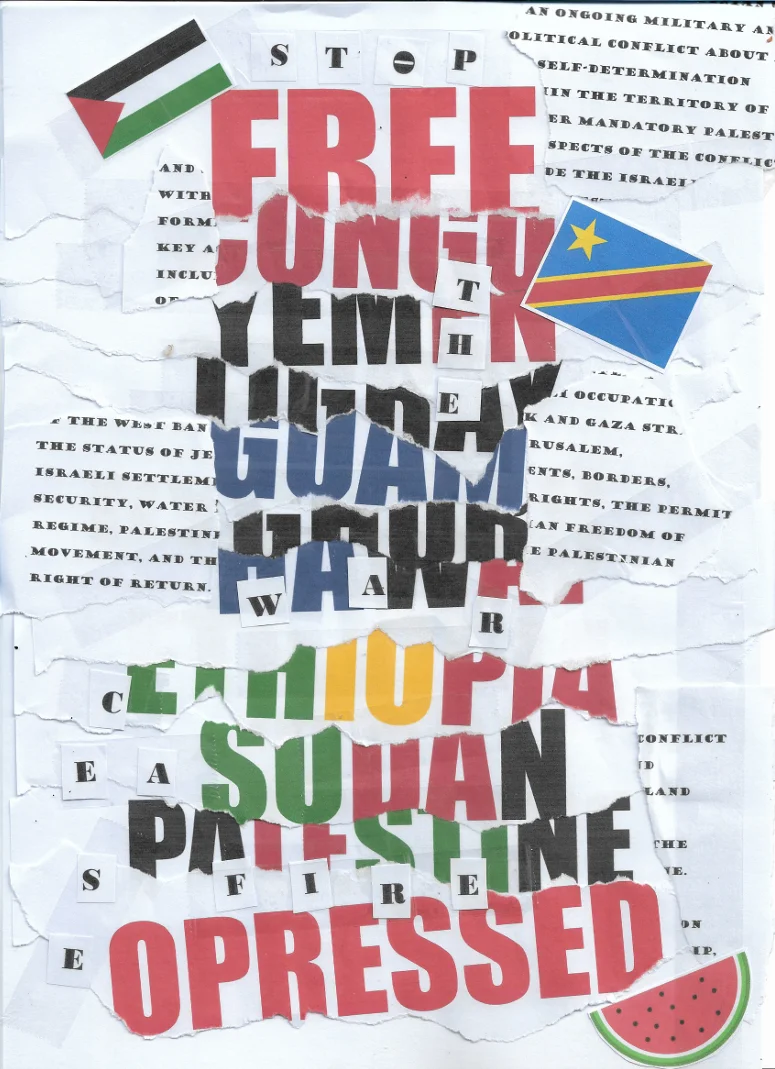
I wanted to create a poster that looks as if it is composed of several
torn posters layered one on top of the other. I wrote 'Free' in red letters,
followed by the names of various countries where protests are occurring or
where there are human rights violation issues. I used colors from each
country's flag. At the bottom, I wrote 'Oppressed' in red letters to form
the phrase 'Free Oppressed.'
I also included flags that appear as stickers pasted onto the posters,
as well as the watermelon symbol, which is used as a substitute for the
Palestinian flag. I’ve incorporated excerpts from the Wikipedia definition
of the 'Israel-Palestinian Conflict.' Finally, 'stop the war' and 'ceasefire'
are scattered throughout; in 'stop,' the 'o' is rotated to resemble a stop sign.
I initially composed all of this in a Word document and printed it out. I then
physically glued the pieces together and scanned them to achieve a more
realistic, tactile result.
Regarding David Carson, I was inspired by his canvas composition.
He uses layers and places elements in close proximity. In its initial
form, my poster lacked the extra 'stickers' and lettering, but I felt it didn’t
fit Carson’s aesthetic and wasn't cluttered enough. Furthermore, for Carson,
every element has a purpose; nothing is placed randomly. I tried to emulate this
through the placement of the country names. I wanted to highlight the disparity
in how these issues are treated—specifically, the greater importance given to some
countries over others. Since Carson prioritizes the emotional delivery of a message
over legibility, I similarly did not focus on whether the viewer could read every
country name or the full text regarding the conflict in Palestine.